Charts in iMonnit and Min/Max/Average Display
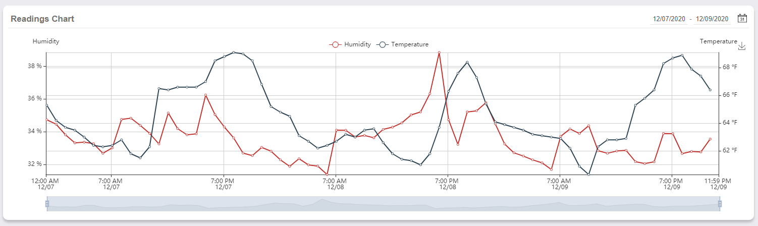
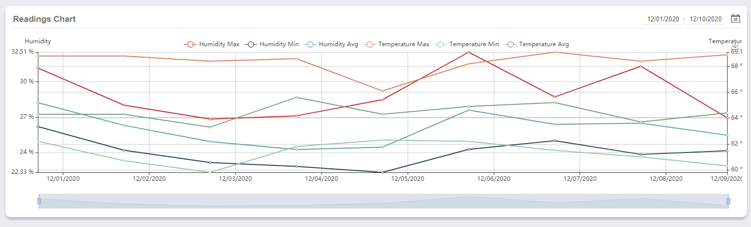
The Charts feature of iMonnit displays a line graph generated by data points or aggregate data with Min/Max/Avg graph lines. This can be a powerful tool when reviewing sensor data. A less than seven-day date selection will display a graph line generated by data points. If the period exceeds seven days, you will receive a graph line generated by aggregate data (Min/Max/Avg).
Charts are automated and cannot be disabled. The Y axes are not configurable.